


An engineer studies electronics at the bachelor level, and what he or she learns are the fundamentals of electronics and how to use these for designing circuits. However, when the engineer joins a company, most of the times, he or she gets to work on real-life products, which are completely different from the circuits that are designed in college, as full product design is a completely intense process where users of the products take the primary position in defining product features.
Structured development process
A typical product design has well-defined steps, and the first phase is called concept phase. Large and experienced product companies follow a structured development process. One of the key things that structured product development demands is usability study, which helps product designers to define the shape and size of the product, along with its user interface (UI). The depth of study varies from company to company.
However, if the product is for use in medical, avionics and other safety-critical applications, usability study is critical and needs to be carried out in detail, covering all possibilities to ensure that the UI does not cause wrong usage of the product or introduce errors. Since usability engineering or UI design (UID) is a specialised area, it often requires special training. Engineers who are trained in UID are called industrial design (ID) engineers. They are trained in aspects like usability, ergonomics and visual cues, among others.

Large companies have specially-trained designers for UID. Smaller companies find it difficult to hire their services as these are expensive. This article aims to help designers who work in smaller companies, as well as professional electronics designers, to design products with essential UI features in their designs. A typical UID has two essential parts:
1. Basic UI rules, which are mandatory in most products
2. Special needs depending on product categories like consumer, safety critical, medical and avionics, which need professional help in designing the UI
What we will see here are standard UID inputs, which will help designers meet the bare minimum UI needs. While this is not exhaustive content, it is good enough to meet the needs of small products, which have no critical-safety functionality requirements.

Usability study
Usability study is a process where ID engineers create product mock-ups (in most cases) and test these with prospective users for feedback. Typically, they create four to five variations to get a feel of what the end customer wants. Spreading the features across three to four mock-ups, instead of putting all features in one, ensures that users will not get overwhelmed and shall provide the feedback in an objective way. This type of study reveals some critical aspects of the product, such as:
1. Shape and size of the product (especially, if the product is handheld or portable)
2. A keyboard, its functions and layout
3. An output devices like a display or an alarm, and its relationship to an input device like a keyboard, knob or lever
4. Sequence of product functions and how users interact with the product
In all these, the focus is on UI so that the user does not commit any induced errors.
Industrial designers are trained to use the mock-up or, sometimes, the functional prototype of the product itself to elicit feedback from prospective users and use the feedback to refine the UI. Usability study for some critical products can go through three to four iterations before freezing on the final one. Over a period of time, this practice has matured and, with experience, it has generated two streams of output for designers:
1. Standard design inputs, which are common to most products, are related to UI components like keyboards, displays, knobs and levers, their layout and grouping, and can be categorised as must-have features.
2. Product specific inputs, which need special design inputs depending on product functionality (for example, touch based slider for volume control), need to be specially assessed by ID engineers.
In this article, we will see some of the must-have features specially related to keys and knobs, among others. These inputs will range from selection of parts to location and colour to be used. These inputs will help designers of small products and designers from small- and medium-size company designers to have a low-cost but acceptable UID. However, they need to be careful about one point; if their designs are applicable to safety-critical industrial systems and medical devices, getting help from professional designers is a must.
Basic usability engineering (UID)
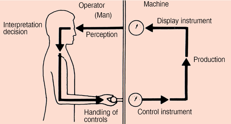
When a human being interacts with a machine (product), there are three types of interactions that take place:
1. Human-machine
2. Human-workspace
3. Human-environment
A good UI will balance the impact of all these equally and ensure that the user is not adversely impacted while using the product.
Let us see what each of these interactions mean to designers.
Human-machine. This interaction involves the influence of the product on the user and his decisions on displays, controls, panel layouts, rate of information dissemination, etc. Essentially, it means how users react to the product’s UI when they are interacting with the product.
Human-workspace. This interaction involves the user, his or her posture, position, how much he or she has to reach out to use the product, product size, structure of the product, and so on. Essentially, this means the impact on the user, especially physically, while using the product.
Human-environment. This interaction involves the behaviour of the user based on the working environment like light, temperature, sound (acoustics), noise, ventilation and radiation. Essentially, this deals with the environment in which the product works and how that will impact the user.
A good example can be an industrial control system with an audio alarm on a noisy shop floor. Normally, the user in this environment will use earplugs to muffle the sound (noise). So if the product has to work in an environment like that, he or she needs to use a visual alarm along with an audio alarm.

UI-human interaction chain
When this loop gets disrupted, external errors happen. While we normally call this human error, the trigger is from the external world. This means that the display and controls of a system (product) need to be designed in a way that induced errors are minimised or removed completely, wherever possible.
With this background, let us look at the types of user interactions and types of users for better understanding of UI design.
Human-machine interaction types
1. Conventional systems or products with switches, keyboards, displays and alarms
2. Computer interface, which is also called human-computer interaction (HCI); typically uses keyboards, touchscreens and monitor displays
Types of users. Users are classified into three categories:
Novice. Someone who is a first-time user of the product (has less exposure to the product)
Expert. Someone who has used the product earlier (knows how to use the product)
Casual. Someone who can use the product; may not be as well-versed as an expert, but would have been exposed to other similar products
This means UID actually needs to cater to the types of usage, as well as the types of users, to be successful. Having understood the usage and user types, let us now see the actual design of a UI and components used for the same.
Essential UIs
For a design engineer, an important element of the UI are keys. Let us understand the design using these.
Controls (input devices). These include switches, potentiometers and valves, among others, and can be further classified into two groups:
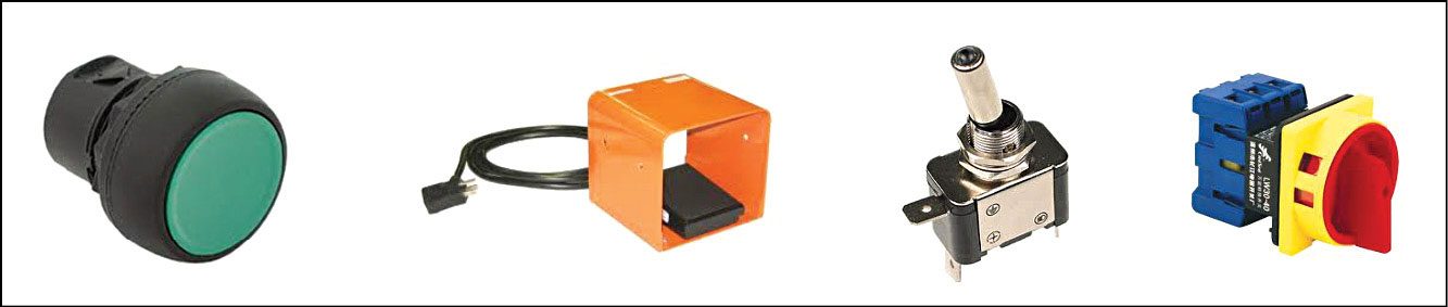
Discrete controls. Each position in a switch represents a separate function, and switches are typically discrete controls. Fig. 2 shows some of the discrete control elements.
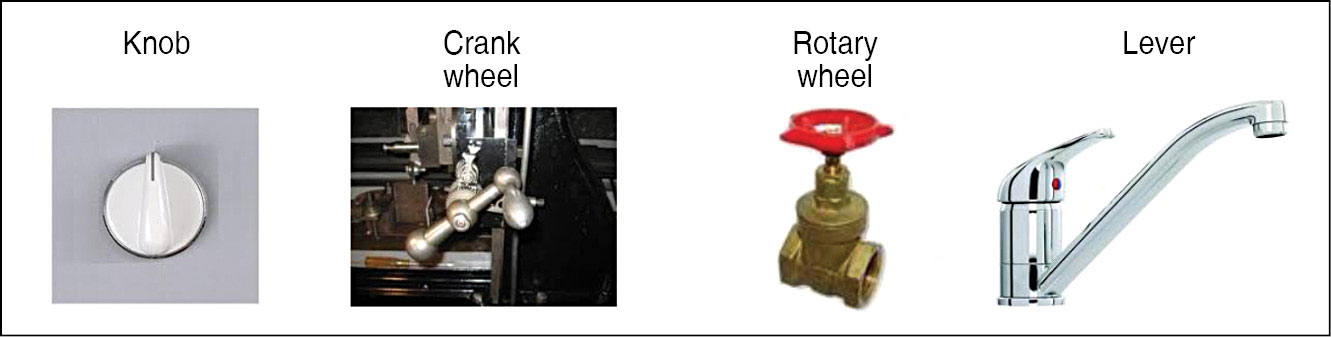
Continuous controls. Continuous controls change in value from a minimum to a maximum. Rotary valves, potentiometers and rotary switches are good examples of continuous controls. Fig. 3 shows some continuous control elements.
Effective controls have four important characteristics:
Accessibility. A control needs to be located in such a way that it can be reached easily and operated comfortably.
Identifiable. A control needs to be identified in terms of what it does in order to operate.
Functional. What a control controls and currently in what state it is needs to be indicated to the user when he or she looks at it. For example, a power-on toggle switch indicates whether it is on or off. This is useful especially when the product does not have a display.
Usability. A control should be easily usable with required force, speed and accuracy. This aspect is very critical, especially in continuous control, where a system’s response is dependent on the control of the overall system.
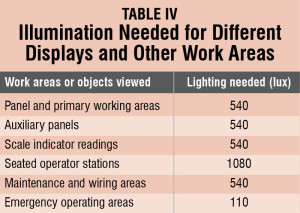
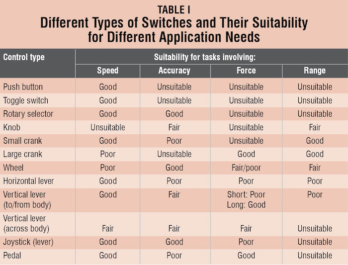
Table I gives a concise view of the different types of switches and their suitability for different application needs.
With the availability of powerful processors and low-cost display technologies, a new input device available these days is the touchscreen, where keys are actually images created by graphics, and the overlay touch mechanism, combined with the software, gives key-like input.
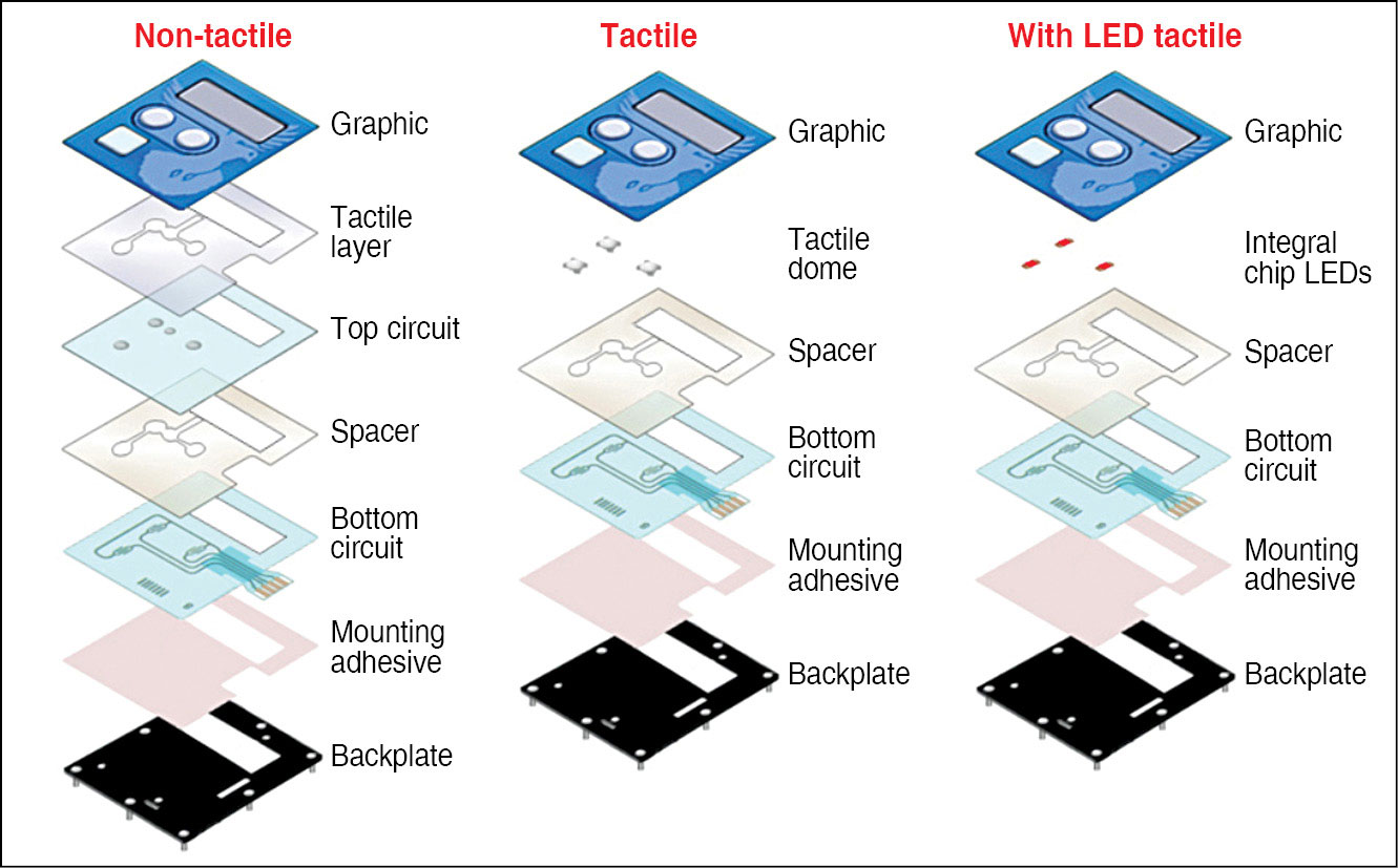
In addition to regular pushbutton switch based keys and touchscreens, another option that is available is known as membrane keys. These are made of PVC sheets of membrane with conductive elements sandwiched to form the key mechanism. The advantage of these keys is their form and shape that can be customised. Their low profile can be less than 1mm thick. Fig. 4 shows the types of membrane keys available and their construction.
While we have seen some critical design inputs, we also need to understand the basic characteristics of different switch types. There are four essential characteristics of switches:
Key size. Determines the ease with which fingers can be used.
Tactile feedback. Feedback that the user gets when the switch is closed, either by Click sound or haptic feedback to the finger pressing the switch.
View. Ability to view at night (whether keys can be illuminated or not).
Number of operations. A very important parameter that most designers miss out. Designers have to estimate the approximate number of times the keys will be used. Based on that estimate, the type of keys can be selected.
Mechanical keys tend to have large operating cycles, while membrane keys have the least. Many designs have failed due to the wrong usage of keys.
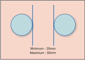
Table II gives the minimum distance that we should have between different keys as a matrix. This can help designers decide the spacing between different types of controls/switches by specifying various combinations of different switches.
Described below are the three types of keys:
Mechanical keys. These keys typically come in standard sizes and are excellent in terms of operational life and reliability. Depending on the working environment, the proper type should be selected (if the environment is dusty or humid, a sealed switch should be used). These come in different sizes and with/without tactile feedback. Since these keys typically come in two parts, main switch and key top, customisation and changes can be easily implemented.
Membrane keys. Membrane keys are the sleekest and can only be custom-designed. While their design is fairly straightforward in terms of usage, these have some restrictions. Since these keys are very thin when placed in a keyboard, it is hard to identify different keys (so old people or visually-challenged users will find it difficult to use instruments having such keys). Also, tactile feedback has to be incorporated in the design itself, and sometimes this needs special processes, as plastic films have to be moulded.
One big challenge is the amount for force that is needed to operate these keys, which is much higher than mechanical keys. These keys are prone to fail when tactile feedback is absent.
Touch keys. These keys are formed with a combination of hardware and software. Typically, the display itself becomes a keyboard with a touch-key overlay and graphics displayed in the display.
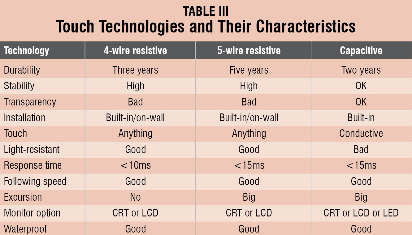
There are three types of touch technologies that are in use: 4-wire resistive, 5-wire resistive and capacitive. Table III captures their characteristics for a better understanding.
Some advantages of the touchscreen are:
1. Points directly to objects; there is a direct relationship between hand and cursor movements (distance, speed and direction)
2. Intuitive to use
3. Since the hand is moving on the same surface as the cursor, manipulating objects on the screen is similar to manipulating these in the manual world
4. Fast, but less precise without a pen
5. A finger can be used as well, apart from a pen (usually no cable is needed)
6. No keyboard is necessary for applications that need menu selections only, and this also saves desk space
7. Suitable for novices, applications for information retrieval and high-use environments
8. Is adaptable; since the keyboard layout is software-generated, it is much easier to support different languages (one reason why ATMs use touchscreens)
There are some disadvantages too, which are as follows:
1. Low-precision (finger): Imprecise positioning, possible problems with eye-parallel axis (with pen, too); the finger may be too large for accurately pointing at small objects (a pen is more accurate)
2. Hand movements (if used with a keyboard): Requires the user to move the hand away from the keyboard; a stylus also requires hand movements (to use the pen)
3. Fatigue: Could strain arm muscles after heavy use, especially if the screen is placed vertically. Also, the user has to sit/stand close to the screen
4. Dirt: The screen gets dirty from fingerprints
5. Screen coverage: The user’s hand, finger or pen may obstruct parts of the screen
6. Activation: Usually direct activation of the selected function, when the screen is touched; there is no special activation button as in the case of a light pen or mouse
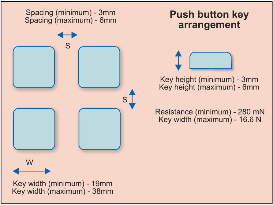
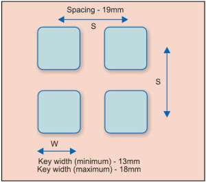
Some design inputs, especially the spacing between different types of keys to be used, are given in Fig. 5 for a push button, Fig. 6 for a touchscreen and Fig. 7 for spacing between knobs, for designers to follow.
Let us now look at displays, which are an integral part of the UI. A UI is complete only when input (keys) and output (displays) go together.
Some displays used in products and design inputs for these are discussed next.
Displays and output devices. In an electronic system, displays can be classified into four major types:
Dials. These have graduated scales on which the indication of a value is shown by a pointer. An advantage of the dials is that these give the relative status of the product by showing where the needle is, as compared to full scale.

Warning devices.
Warning displays call for attention and require action. For example, a red traffic light means that you must stop your vehicle.
Indicators. These displays have no graduated scales, but display text or numeric information, to show the state of a system. A good example is a digital panel meter, which shows the reading but never tells the maximum or minimum, unless explicitly mentioned.
Counters. Counters show the information directly as numbers.
Based on their functionality, displays can be grouped into three major categories:
Quantitative displays.
1. These display exact information. Digital quantitative displays present information directly as numbers. An example is a digital clock.
2. Analogue quantitative displays can also be used where the length or angle represents the information. For example, a thermometer where the column of mercury or alcohol represents temperature.
3. Use of a particular quantitative display depends on the kind of information that is required. If you need a precise reading, then digital indicators are most easily read.
Qualitative displays.
1. These displays give information about particular states, for example, hot or cold, alarm or no alarm, etc. These can provide information about the rate of change or direction of deviation from a desired value.
2. These displays may include indicators and warning devices, and can be used in circumstances where you only need to know whether a certain condition exists. For example, when temperature of a steam iron becomes too high, it switches off, which is indicated by a small red light (bulb) that goes off.
Representative displays.
1. These displays can portray either working models or simplified diagrams of a complex process, system or machine. These enable the perception of the functioning of each part of the system or machine in correct relation to the whole system. Most underground rails (metros) and ordnance survey maps, railway signal panels and plant mimic diagrams are examples of these displays.
Now, let us see the factors that impact displays when these are used in products. When displays are combined with input devices, the challenges are many. Some key elements are:
Viewing distance. This is the distance from where users can read the display and operate controls. Typically, distances vary from 300mm to 750mm. Any distance beyond this will strain the user.
Illumination of displays. LED based devices have built-in light emission and, hence, illumination is easy to control. However, when the product uses liquid crystal displays (LCDs), the design becomes complex. While some LCDs are reflective and need external lights to work, other LCDs work with backlights, the intensity of which is key for display illumination. Designers need to choose the right illumination, depending on external light availability where the product will be used.
Viewing angle. This is a critical parameter, which most designers miss. The best view is possible when the user is at 90° to the display plane (right in front of the display).
Viewing angle of the display can be defined as the angle at which the display will be legible from the 90° position. LCDs have a restricted viewing angle (typically about 20° to 30°). Higher the viewing angle, better the viewing, but greater the cost.
Also, when the LCD is mounted in a slanted position, the viewing angle should be with respect to the slant. This angle of slant is important when keys are mounted along with the display. Table IV gives the illumination needed for different displays and other work-related areas.
Combining displays and inputs. Displays and their associated controls should be designed and located such that the user can select the correct control and operate it effectively, without errors.
Combining multiple displays. When multiple displays provide information to the user, he or she will invariably have to divide the attention between a number of tasks, as well as displays. Any inconsistencies in the manner of information representation among displays will be confusing. This will reduce the speed of reaction to change, indicated by displays. This can even cause reading or decision errors. If a number of displays look alike, the user may interpret data incorrectly. Each display should be easily distinguishable from, and its information should not be easily confused with, any other display.
Designing the keyboard and display together (UI)
Now that we have seen the design of input devices and displays separately, let us now see, when we design a system, how these two have to be put together in a balanced way. When a product is designed, there are three primary aspects that need to be addressed, which are:
Aesthetics. Deals with how the product looks
Ergonomics. Sees how easy it is to operate the product and that the product does not impact the user adversely
Engineering. Checks how easy it is to manufacture the product, without increasing the manufacturing cost
A UI is guided by the following three principles from an ergonomics perspective:
Operation sequence. Determines how the product is operated using keys (input) and displays (output)
Frequency of use. Checks how frequently the UI will be used
Centre of attention. Check which elements in the UI need higher attention
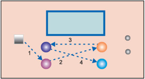
Let us see how a user can use this concept, with the following example. Refer to Fig. 8, where a front panel with a display, switch and knobs are shown, and where arrow marks show how the user uses the interface.

You can see how the key sequences go across the product face. This could have been due to the functional grouping of keys, knobs and displays. However, when the user will use this, he or she must remember the sequence of travels across the face of the product every time he or she uses the product.
Instead, if keys are arranged in the use sequence order shown in Fig. 9, the user can remember the sequence of use easily and use the product with ease. This effectively demonstrates how an ergonomic UI can be designed.
Next is the frequency of use. To help users use the product quickly and easily, following rules will help in designing an effective UI:
1. Controls and displays associated with each other should be placed in a compatible way
2. There should be a very clear demarcation between visual display elements and controls
3. Horizontal hand movements are better than vertical
4. Movement of hands towards the body is better than away from it
5. Horizontal orientation of keys is often preferred
6. Square keys are preferable as compared to other shapes
7. The maximum number of keys in a row should not be more than four
8. Most frequently used buttons should be on the right side of the system
Finally, let us see the engineering aspect of the UI. This essentially ensures that the UID is easily manufacturable and does not need a complex assembly process. This is also important from the product-service point of view.
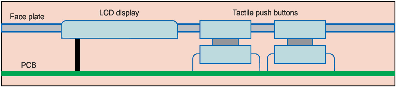
Figs 10 and 11, respectively, show how a push button and a membrane key, both LCD UIs, can be designed for ease in manufacture.
These two designs are representative designs as engineering depends on the components and the manufacturing process used. Higher the automation, more the precision needed for the design.